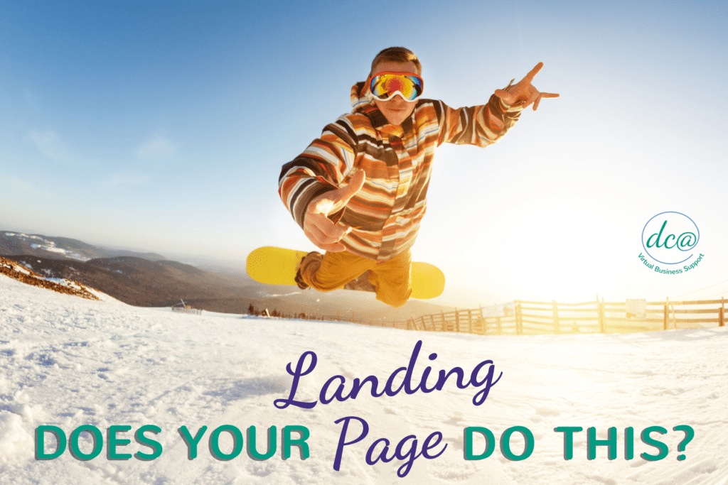
Does Your Landing Page Do This?
Recently, I was on scrolling on Facebook and saw this amazing ad for a ski resort in Big Sky, Montana. It was a contest to win an all-inclusive vacation to their resort. I was immediately hooked! Who wouldn’t want a free vacation? After completing their form, I received an email from them. Before you get excited, I wasn’t the winner… it was an email discussing their BEACH vacation packages. Nope, not the beautiful mountain resort that I was super excited about. I wasn’t interested in a beach resort; I’ve been there, done that. I wanted a new adventure!
What happened in the scenario above? There was a disconnect between what the consumer was looking for and what was delivered. The Facebook ad worked. It had gathered interest, prompting someone to click on the ad. They completed the form on the landing page they were taken to. But it didn’t deliver what was expected.
Your landing page is your company’s voice. It informs consumers of products or services they are interested in. This is why it’s important that you have a well formed system, so you deliver what’s expected. We’ll take you through what your landing page should have. When you’re ready to build yours, you have a thought out plan to put into action.
What is a landing page? A landing page is a great way to gather information from potential customers. From there you’ll be able to continue the conversation regarding your products or services. Whether you’re offering a free webinar, downloadable item such as a pdf, or a contest entry, landing pages are designed to collect data. The information you receive allows you to continue marketing to the individual.
What should your landing page include? You should have a headline, offer and call to action. And, always remember to KISS – keep it simple stupid. No! I am not insulting you. This is a tried and true method. Your page should focus on one item and be clear about what the individual will receive for completing the form. Remember, people lead busy lives and their time is valuable. Keep it simple so they can read quickly and act if they wish. Here are a few powerful statistics to keep in mind:
“Landing pages with multiple offers get 266% fewer leads than single offer pages.” – Wishpond
“The average attention span is 8.25 seconds.”- Statistic Brain
Alright, let’s dig a little deeper into your landing page.
These two key questions should be answered before planning your landing page. Who is your audience? What do you want to achieve? Knowing the answer to these questions will make the other information fall into place.
Amazing landing pages have these 7 key elements. Include these seven elements to increase your conversion rates.
1. A captivating headline. This is the first thing visitors see. Make sure the headline grabs their attention.
2. An amazing offer they can’t pass up. Would you give someone your personal information for your offer? Highlight why your offer is so amazing.
3. Graphics that catch their eye. People are drawn to graphics, makes sure yours stand out. They should emphasize what’s being marketed on your landing page.
4. An interesting video.Eye View Digital found that videos increase conversion rates by 86%.
5. Trust indicators. Show that you are trustworthy. Add testimonials/reviews, logos of your customers as well as any industry certifications you hold.
6. A clear call to action. Users should know why they were sent to your landing page. Do they sign up, download, or schedule a consultation?
7. A post conversion page to keep their interest. Follow up with your new leads with another offer or a simple thank you.
Now onto the fun stuff!
Personalize your landing page with Dynamic Content. If you’re not familiar with this marketing tactic, it’s basically a way to personalize your landing pages and emails to your visitors. It’s also what went wrong in our initial scenario. Instead of sending me information about my mountain escape, I was sent information about a hot, sandy beach that I’ve been to a million times…. talk about disappointment. Use the information you know about your visitors to send them what they want, you’ll increase engagement and help lead them through the sales pipeline faster.
How do you include dynamic content? You can insert the users name on the landing page, change graphics to reflect the visitor’s interests, provide recommendations based on a recent purchase or change the copy on the landing page based on the user’s location.
Once you’ve completed your amazing landing page, what do you do? You should test your landing page. You should always be the first person to sign up. That’s the best way to see if there are any errors. In fact, have a few of your coworkers, employees or even family test it out to see that it is functioning as you’d like.
If you’re stuck or just prefer to leave this work to the marketing experts, schedule a call with us today. We’ve created successful landing pages for others and would love to do the same for you.
